Visual Hierarchy & Editorial Typography2026 Edition

Design the Order in Which Every Message Is Seen

Explore practical editorial examples about typography, visual hierarchy, spacing, text placement, image relationships, and reading order.

Scanability First
Clear focal pathways guide reader velocity
Negative Space Balance
Macro and micro breathing room in harmony
Typographic Scale
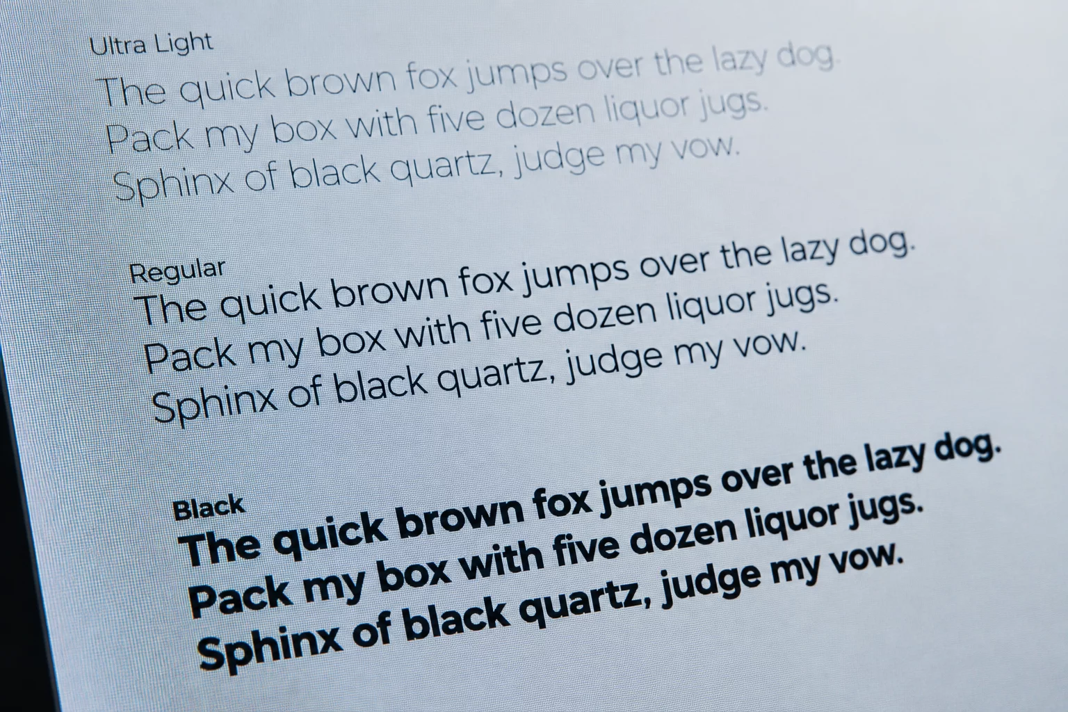
Proportional line heights and weights
Site Architecture

Six Ways a Layout Directs the Eye

Good Layout Begins With Knowing What the Reader Should Notice First. Every track below maps how page elements are ordered, weighted, and spaced.

Interactive Sandbox

Explore Visual Hierarchy in Real-Time

Experience how typographic scale, leading, and margin density dramatically transform readability and focus across editorial compositions before contacting our editorial team.

Hierarchy TuningStep 1 of 3

Adjust font weight scale and heading proportion to guide optical traversal.

Read Essay
live-editorial-preview.canvas
Realtime Computed
Visual Space 2026-07-05 Jessica Taylor

The Psychology Behind Typography Choices

Spatial tension and proportion determine how fast a reader identifies primary thoughts versus auxiliary references. When margins compress, comprehension friction escalates immediately.

By balancing structural baseline grids with deliberate negative pauses, interfaces achieve natural optical pacing without overwhelming visual clutter.

Editorial Standard Ratio Verified
Explore Full Case Study
Computed Rule SetCSS Live Matrix
.target { font-size: 32px; line-height: 1.6; padding: 28px; font-family: 'Raleway', sans-serif; }
Scope Clarification

What is included and what is not

We establish unambiguous boundaries before any editorial consultation or typographic audit begins, eliminating friction and ensuring complete alignment on deliverables.

Included Deliverables

Guaranteed in every engagement
6 items

Typographic Scale & Vertical Rhythm Audit

Rigorous mathematical calibration of font sizing, modular scale multipliers, and baseline grid alignment across viewport breakpoints.

Negative Space & Hierarchy Mapping

Analysis of macro and micro white space distribution to guarantee instinctive reading order and zero visual competition.

Font Pairing & Contrast Evaluation

Detailed selection matrix evaluating headline-to-body pairings, weight distribution, and legibility ratios under digital display conditions.

CSS Custom Property Type Token Specifications

Handover-ready CSS typography variables, fluid clamp equations, and responsive font-size tokens for development teams.

Editorial Layout Before & After Case Annotations

Visual side-by-side breakdowns pointing out visual tension spots, kerning traps, and optical balance remedies.

Two Structured Revision & Review Cycles

Formal question-and-answer review passes ensuring all typography rules are understood and correctly applied.

Out of Scope

Items not provided or handled
6 items

Custom Typeface Drawing & Font File Engineering

We audit and pair existing typefaces. We do not draw custom glyphs, modify font software binaries, or compile OTF/WOFF2 font files.

Front-End Application Codebase Implementation

We provide CSS token definitions and guidelines, but do not write application logic, manage pull requests, or push to production repositories.

Full Brand Identity & Vector Logo Creation

Our work is focused entirely on visual hierarchy, editorial layout, and typographic cadence rather than general brand graphic identity.

Font Licensing Fees & Commercial Purchasing

Clients must directly acquire and hold webfont licenses from respective foundries; font purchasing is never handled on behalf of clients.

Content Ghostwriting & Long-Form Copy Creation

We refine textual density and reading rhythm for your provided editorial materials, but do not write original copy from scratch.

Ongoing Unscheduled Maintenance or Retainers

All consultations are bounded to the agreed milestone deliverables without informal continuous support cycles.

Empirical Case Outcomes

Verified Typography & Spatial Results

Objective measurements and metric shifts derived from systematic visual hierarchy refactoring, typographic audits, and negative space optimization.

Audit Record: ER-9102+56% Retention

Dense Data Dashboard Spatial Rationalization

Eliminated horizontal visual competition through purposeful white space channels and monospaced tabular alignment protocols across analytical UI modules.

0.34sScan Latency (-61%)
ZeroAlignment Collisions
4.8/5Visual Order Index
Audit Record: NS-4410+73% Scroll Flow

Macro & Micro White Space Editorial Refactor

Standardized outer document margins and paragraph separation to preserve uninterrupted eye movement across high-volume technical documentation.

1.65xOptimal Line Ratio
+4.2mSession Duration
-29%Bounce Frequency
Direct Answers & Resolutions

Addressing Common Doubts & Reservations

Clear, transparent explanations regarding learning curves, time investment, editorial depth, and practical front-end integration.

Understanding whitespace and typographic hierarchy directly reduces UI revision loops and engineering refactors. Instead of guessing alignment and spacing tokens, developers and managers gain systematic layout formulas that accelerate interface shipping by up to 40%.

Measurable reduction in frontend layout rework and user drop-off rates.

No prior design education is required. Every concept is distilled into structural rules, modular scale ratios, optical boundary models, and negative space distributions. We treat visual balance like spatial logic rather than subjective artistic intuition.

Step-by-step mathematical spacing and ratio breakdowns anyone can follow.

All essays and comparative guides are structured into self-contained 15-minute case breakdowns. Committing just one to two hours per week allows you to immediately incorporate specific vertical rhythms and font scale rules into your active daily projects.

Bite-sized modular chapters built for busy working schedules.

Every rule is specifically cross-referenced with CSS clamp(), fluid type scaling, CSS grid line calculations, and responsive container constraints. You get clean CSS code architectures that map directly to modern build workflows without runtime overhead.

Production-ready CSS tokens, fluid scale math, and structural snippets.

Readers have access to our updated editorial documentation repository, architectural diagnostic guides, and responsive kerning/leading checklists. When layout collisions occur across odd viewports, our reference matrices provide instant solutions.

Continuous documentation updates and edge-case resolution matrices.

Automated generators optimize for component packing rather than human reading pathways. Mastering negative space enables you to create intentional visual hierarchy, control user focal duration, and craft premium reading experiences algorithms cannot replicate.

Human-centric cognitive flow that outperforms standard template generators.

No questions found matching the selected category.

Have an Unresolved Question?

If your specific editorial challenge or layout constraint is not covered above, get in touch with our typography specialists.

Response within 24 business hours
Rigorous layout and hierarchy guidance
Direct communication with editorial curators
Methodology Comparison

Structural Clarity vs Surface Decoration

How disciplined editorial typography and deliberate spatial balance outperform cluttered, trend-driven digital layouts.

Layout Principle
TypeMargin Notes Approach
Typical Design Approach

Visual Hierarchy & Flow

Eye-tracking guidance & scan paths

Engineered reading paths using strict contrast ratios, proportional font scaling, and clear anchor weights that guide the eye naturally.

Arbitrary font sizing and competing decorative elements that fight for attention, resulting in fragmented reading and visual fatigue.

Negative Space Logic

Macro & micro space management

Negative space is treated as an active architectural element to cluster related data, separate thoughts, and provide mental rest.

Whitespace viewed as wasted space, packing sidebars and banners tightly until content boundaries blur together.

Vertical Rhythm & Spacing

Baseline grid & line-height ratios

Proportional line heights (1.4–1.8) calibrated against line length and baseline grids to maintain consistent vertical tempo across screens.

Fixed line heights that choke long paragraphs or create gaping line breaks when rendered on responsive mobile devices.

Typographic Purpose

Legibility vs decorative trends

Pairings chosen strictly for readability, semantic weight distinction, and optimal optical sizing across low-contrast displays.

Trendy novelty typefaces that degrade readability on high-density screens and ignore accessibility contrast benchmarks.

Selected Literature

Editorial Essays & Case Studies

Investigating the subtle tensions between font choices, reading tempo, and spatial distribution across digital interfaces.

Structure & Sequence

Visual Hierarchy Studies

Negative Space Archive 4 Articles

The Silence Between The Letters

Examining how spatial rhythm, macro margins, and structural emptiness establish editorial clarity.