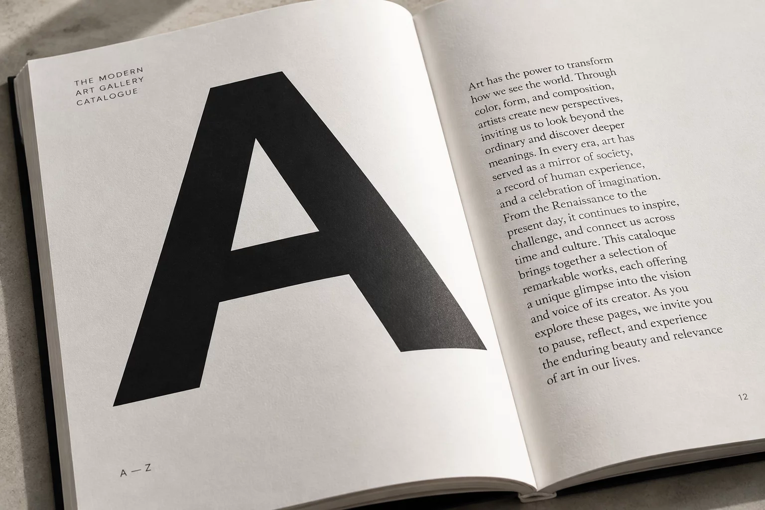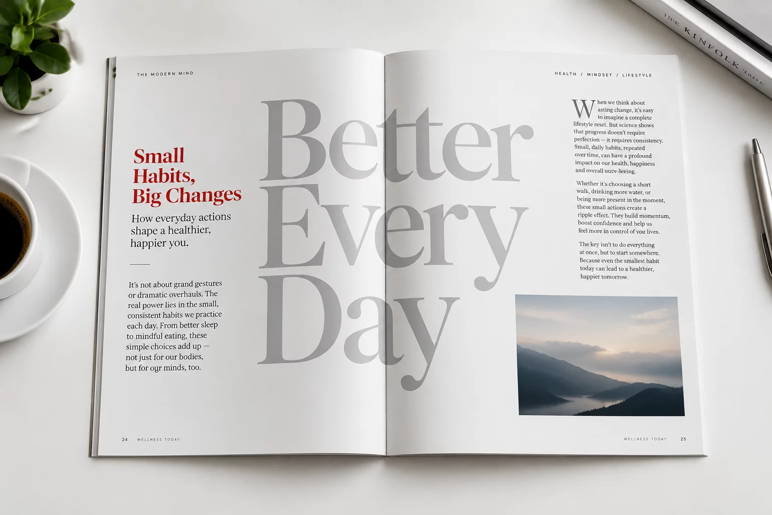
Why the Largest Headline Isn't Always the First Thing Seen
Examining how contrast, surrounding negative space, and focal anchoring often override sheer point size in visual scanning.
Critical perspectives on type choice, optical balance, structural readability, and the unspoken physics of editorial typesetting across print and modern screens.
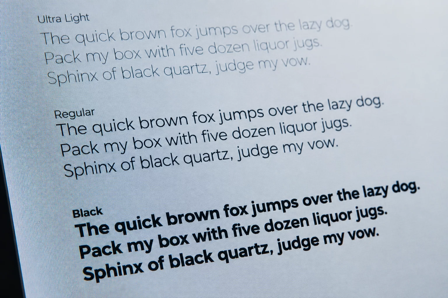
Investigating how subtle shifts in letterforms, proportional leading, and typographic scale govern user cognitive load.
Each essay dismantles fundamental assumptions regarding text rendering, cognitive hierarchy, and responsive type architecture.
Receive complete PDF editions, annotated layout specimens, and deep-dive technical monographs directly to your inbox every month.
Select your preferred tier and enter your details to gain immediate access.