Luminance Contrast vs. Physical Scale
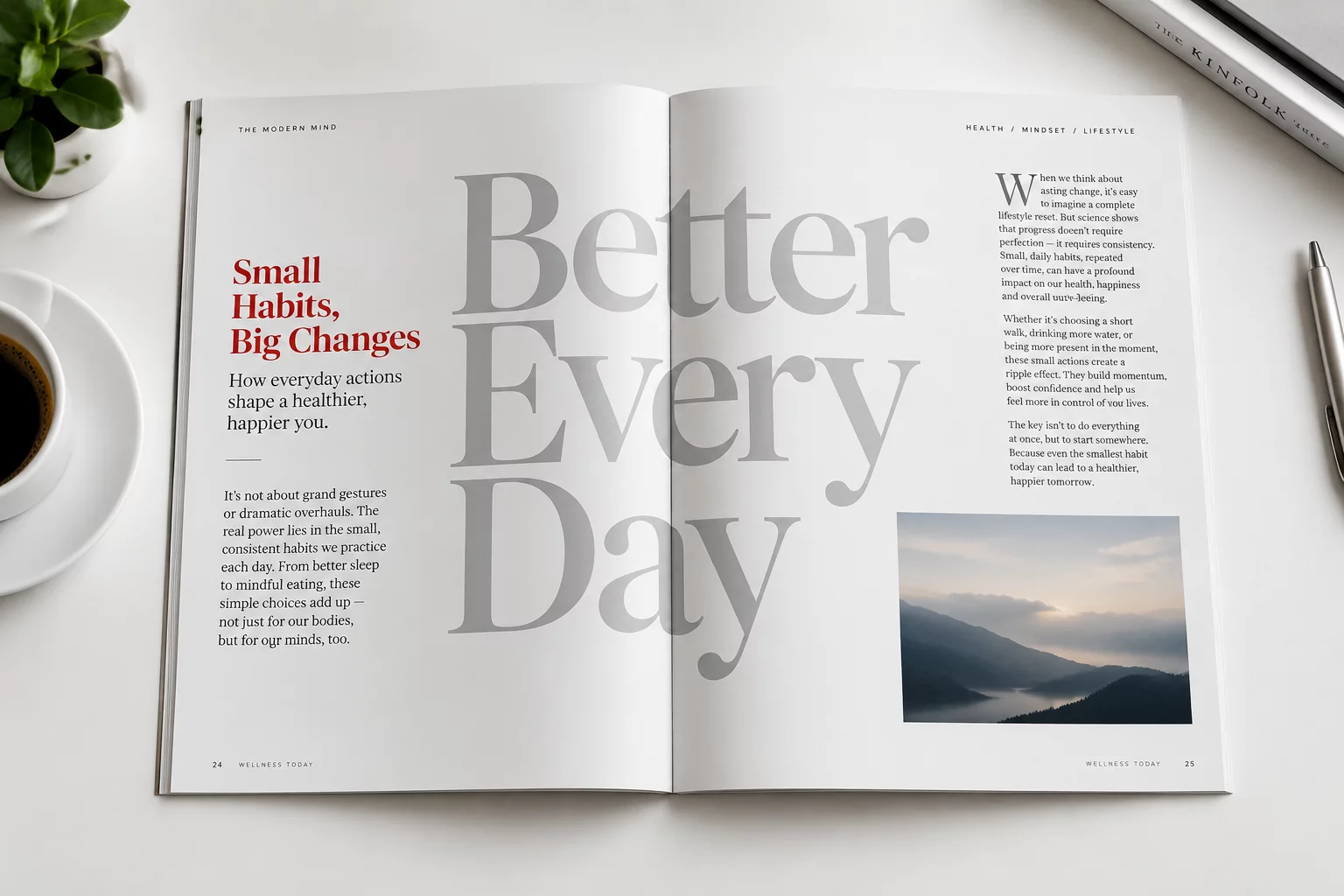
When someone opens a printed publication or loads a digital article, the eye does not methodically measure bounding boxes to determine where to look first. Instead, early visual processing scans the visual field for sharp luminance gradients. A gigantic 80pt display heading set in subtle graphite against a muted slate backdrop recedes into the background when placed near an 18pt bold phrase in sharp white surrounded by generous space.
Scale without contrast produces texture rather than focal dominance. In dense editorial spreads, massive letterforms that intersect with background images or sit flush against neighboring columns lose their distinct outline. The visual cortex perceives them as background pattern, allowing isolated micro-elements with crisp edges to pull the reader gaze instantly.
Typography becomes audible through contrast. A whisper framed by complete silence commands more attention than a shout echoing inside an overcrowded room.
— James Wilson, Senior Editorial TypographerPerceptual Mechanisms That Override Font Dimensions
Multiple structural dynamics routinely govern initial fixations before type size ever registers:
- Chromatic Saturation: An intense accent color creates immediate foveal attraction, pulling ocular attention ahead of neutral monochrome headings.
- Spatial Margins & Isolation: A compact caption with ample surrounding white space generates a gravitational pull that busy headline clusters cannot match.
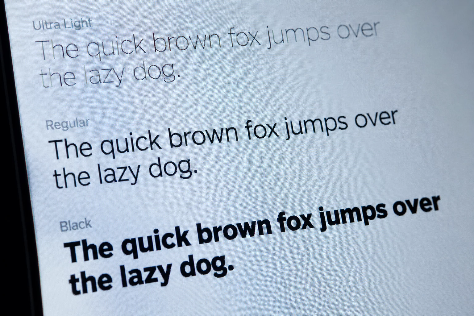
- Stroke Density: Heavy black letterforms concentrate ink density into a single point of visual mass, while thin hairline display faces diffuse focus across wide areas.
Designing Intentional Multi-Tiered Reading Paths
Mastering typographic hierarchy requires orchestrating size alongside position, contrast, and negative margins. Designers can use the squint test or apply a slight blur to a layout preview to quickly reveal which element truly seizes initial awareness. If the intended headline dissolves while a secondary sub-badge stands out, the balance between scale and contrast requires calibration.
When these forces work in harmony, editorial compositions gain clarity and rhythm. An oversized display title can gracefully establish atmospheric context in the background, while crisp, high-contrast subheadings guide the reader through complex informational hierarchies with effortless precision.
Related Architectural Essays