
F-Patterns, Z-Patterns, and Spatial Disruption
When users land on a document, their vision does not move like a scanner across a flatbed. Instead, ocular fixations jump between distinct typographic anchors. Western reading conventions train the eye to seek starting points on the upper-left margin, yet an offset subhead or an indented phrase can arrest this motion instantly. Spatial isolation pulls the eye toward unexpected coordinates, effectively resetting the visual hierarchy.
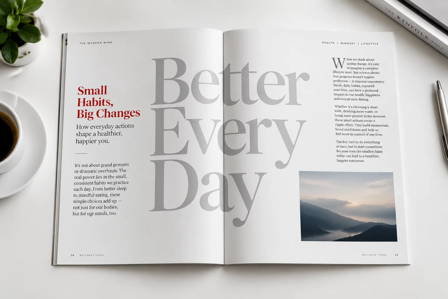
Eye-tracking studies demonstrate that staggering paragraphs or shifting pull quotes across column boundaries alters the order of comprehension. Placing a secondary note closer to an imagery focal point frequently prompts users to read contextual commentary before tackling the primary thesis. Spatial proximity repeatedly overrides chronological placement.
Typography is not merely the choice of a typeface; it is the deliberate orchestration of time and attention through physical space.
— Editorial Design PrinciplesThree Spatial Mechanisms That Redirect Attention
By adjusting typographic coordinates relative to page margins and surrounding blocks, designers construct intuitive routes for the reader's gaze. Three core mechanics drive this redirection:
- Asymmetrical Indentation: Offsetting a paragraph by just twenty pixels breaks continuous scanning and forces a conscious pause.
- Anchor Proximity: Positioning explanatory annotations directly beneath interactive elements ensures they are consumed prior to adjacent body copy.
- Perceptual Grouping: Tightening whitespace between related headings and summaries establishes immediate thematic clusters that override default vertical reading.
Balancing Layout Innovation with Cognitive Load
While creative text placement enlivens an editorial spread, excessive disruption risks disorienting the reader. When text blocks float without clear horizontal or vertical baselines, cognitive load surges as users struggle to identify the narrative progression. The goal is purposeful guidance rather than geometric novelty.
Mastery in editorial typography lies in subtle manipulation. Grounding experimental placements against a disciplined underlying grid allows unexpected alignments to feel intentional, guiding readers through complex arguments with natural clarity.
Related Architectural Essays