The Physics of Optical Density on Screen Surfaces
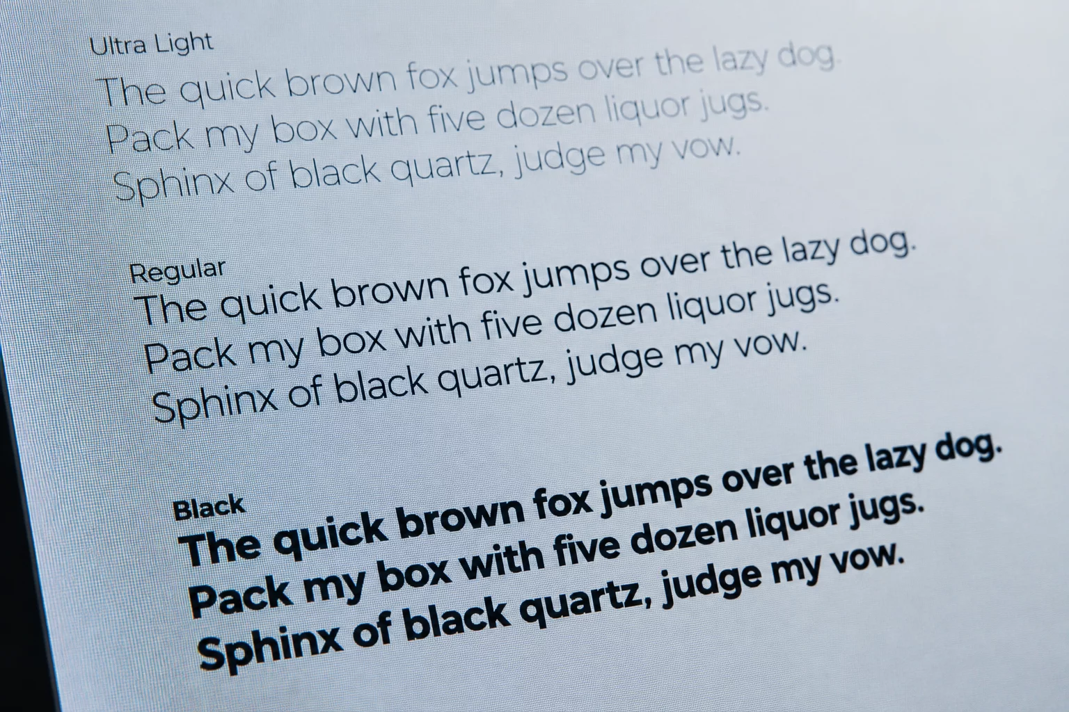
High-contrast digital displays accentuate the luminous ratio between typography and background canvas. When strokes expand in thickness, they displace negative space at a rapid rate, creating concentrated islands of contrast. Readers do not begin by parsing character semantics; their eyes lock onto high-contrast clusters before decoding letterforms.
This physiological reflex explains why an interface populated with bold labels throughout degrades into visual noise. When every data point screams with 700-weight blackness, optical gravity scatters unpredictably. Selective weight application preserves clear entry points, allowing readers to traverse nested information layers naturally.
Weight is not merely emphasis; it is the gravitational field that dictates how fast an eye glides across a composition.
— Michael Brown, Editorial Systems ResearcherCalibrating Contrast Levels Across Screen Scales
Establishing distinct optical tiers requires careful calibration rather than arbitrary font-weight jumping. Interface designers achieve clearer results by pairing weights that differ by at least two numeric increments:
- Jump at least 200–300 weight units (such as Regular 400 with Bold 700) to ensure unambiguous contrast under variable screen brightness.
- Reserve ultra-heavy weights (800–900) strictly for short anchors, preventing ink-trap clogging and glyph collision on high-DPI panels.
- Counterbalance dark UI modes by stepping weights down slightly, as light text on dark surfaces naturally radiates outward.
Avoiding Weight Inflation in Complex Data Tables
In data-heavy dashboards, product designers frequently overuse bolding to highlight numbers, statuses, and column headers simultaneously. The resulting layout loses all hierarchy. By maintaining regular weights for tabular figures and relying on subtle weight elevation solely for active state indicators, interfaces retain high legibility over extended work sessions.
Deliberate restraint in font weight fosters an intuitive scanning cadence. When weight changes indicate meaningful semantic shifts rather than mere decoration, users process interface state changes in fractions of a second.
Related Architectural Essays