
Exploring Visual Hierarchy in Affinity Design Workflows
Understand How Typography and Layout Work Together in Affinity
Explore independent educational examples about text hierarchy, spacing, image placement, and composition using Affinity design workflows.
Mastering Compositional Anchors & Visual Weight
When orchestrating complex layouts in vector and publishing environments, visual hierarchy dictates how quickly a reader absorbs critical information. By calibrating scale ratios, leading distributions, and optical alignment, designers can transform raw technical copy into intuitive editorial structures.
Geometric Grid Systems
12-column dynamic baselines for modular positioning.
Modular Typographic Scales
Mathematical contrast ratios (1.250 Major Third).
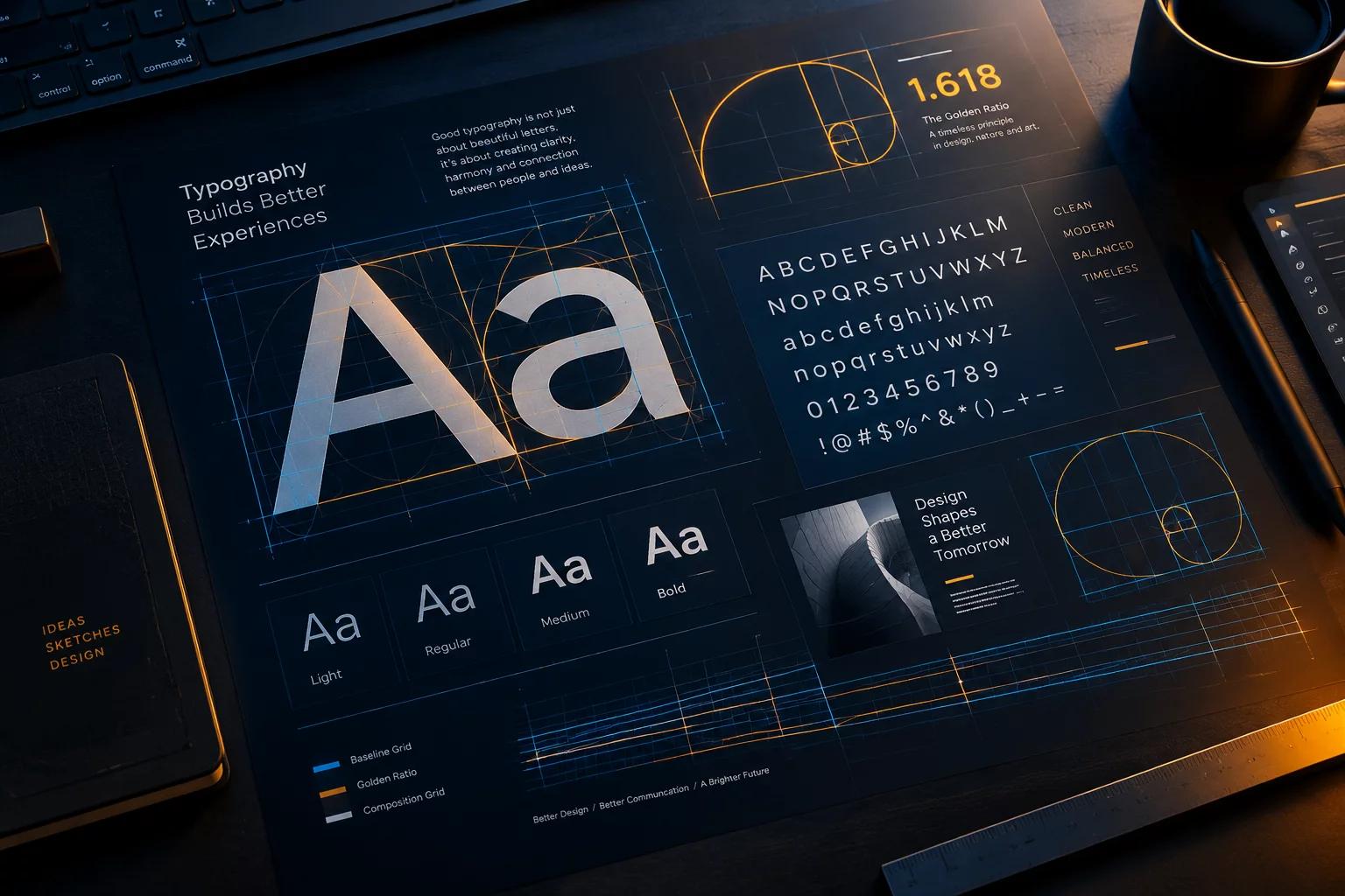
Visual dissection of micro-whitespace and typographic contrast planes.
Layout Hierarchy Comparator
The Architecture of Scanability
Human eyes traverse page canvases following predefined gravitational vectors. Establishing clear anchor elements prevents cognitive fatigue and guides intent.
By synchronizing line-height with baseline grid divisions in publishing suites, editorial designers preserve vertical flow even across asymmetric multi-column layouts.
Three Pillars of Editorial Composition
Practical techniques applied across design projects to elevate legibility, focus, and rhythmic cadence.
Proportional Spacing
Space between headers and body copy must reflect logical parentage. Applying the law of proximity ensures readers intuitively grasp conceptual groupings.
Explore Negative SpaceTonal Value Calibration
Contrast is more than just font weight; it encompasses text color, tint value, and background luminance to create a layered sense of depth.
Visual Hierarchy Deep DiveGaze Trajectory
Design elements function as signposts. Strategic placement of supporting chips, pull quotes, and anchors gently steers eye movements.
Read Typographic NotesWorkflow Questions
Answers to common structural and compositional inquiries encountered when planning editorial files.
All examples and frameworks here are independent educational studies for design enthusiasts.
Baseline snapping forces all lines across adjacent columns to share common horizontal axes. This eliminates jarring optical friction when eyes scan across column gutters.
For digital and print layouts, the Major Third (1.250) or Perfect Fourth (1.333) scales provide optimal distinction between H1, H2, and body copy without demanding excessive page height.
While generous margin isolation gives elements prominence, it cannot substitute for strict WCAG contrast compliance. We recommend maintaining at least 4.5:1 for body copy and 3:1 for large display titles.