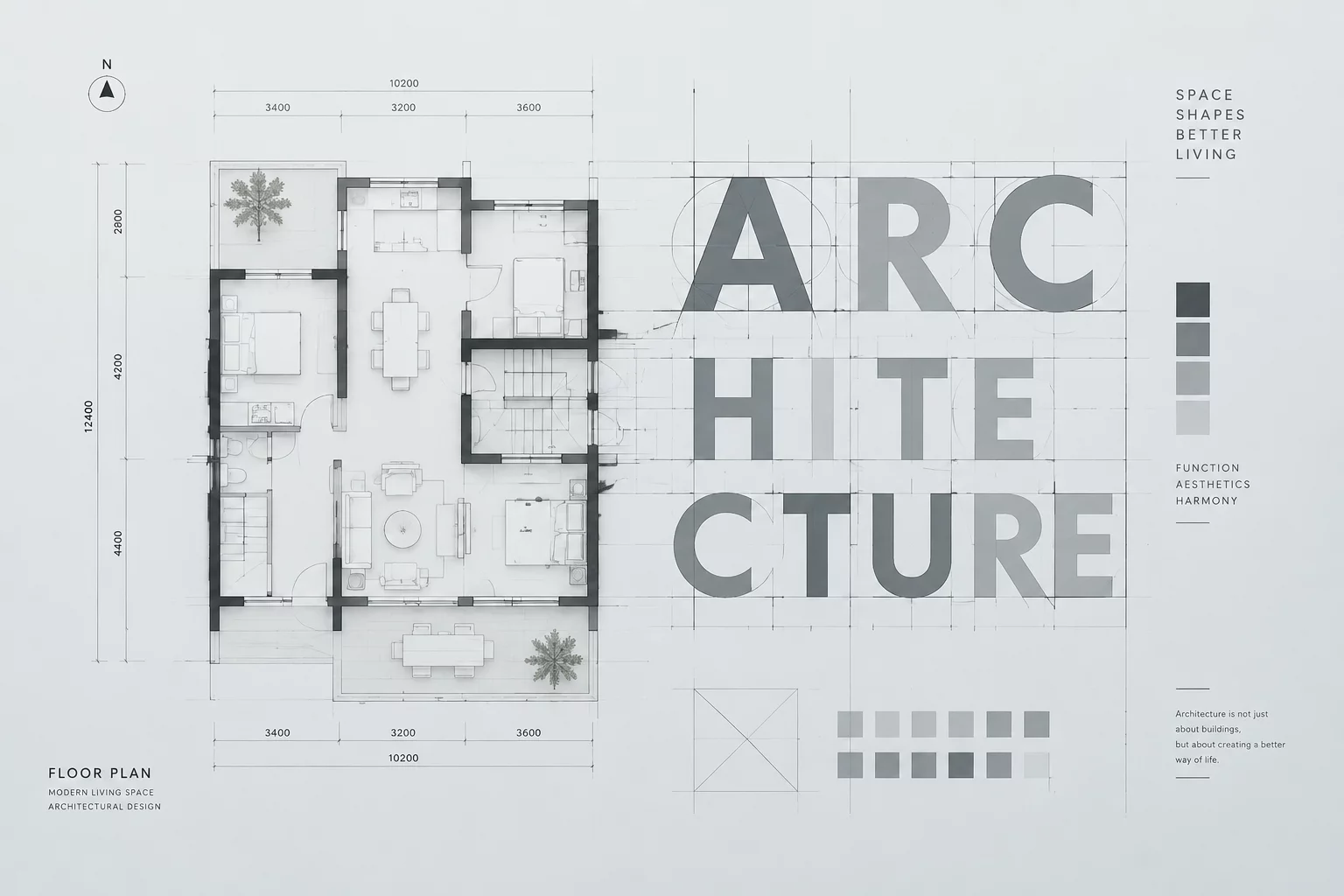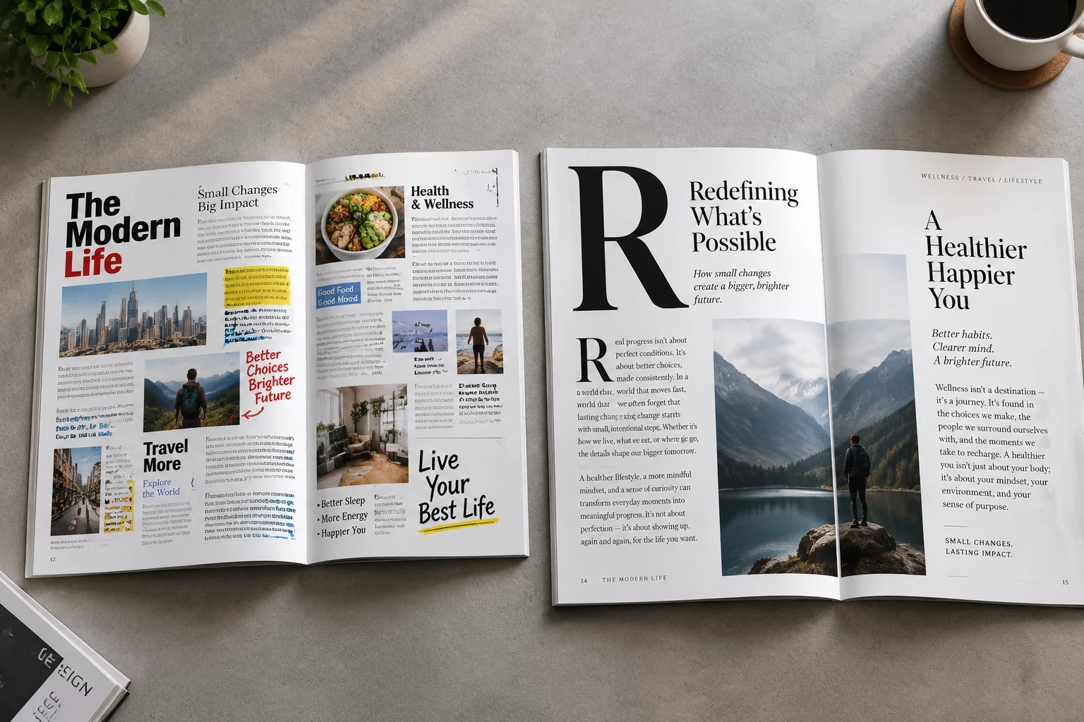
One Message, Three Different Reading Paths
How changing the dominant visual anchor alters user attention and comprehension sequences in identical editorial content.
Understanding how focal points, spatial positioning, optical weight, and contrast create seamless navigation and intuitive reading sequences across modern compositions.
True visual hierarchy doesn't shout at readers; it guides attention purposefully from dominant primary entry points down to subtle contextual anchors.
Each analysis dissects real-world compositional challenges, detailing practical methods for organizing typography, contrast, and layout architecture.
Subscribe to our bi-weekly breakdown of interface layouts, typographic hierarchy experiments, and compositional critique.
Receive structured layout case studies and typographic design guides directly in your inbox.