Version A: The Pitfalls of Uniform Prominence
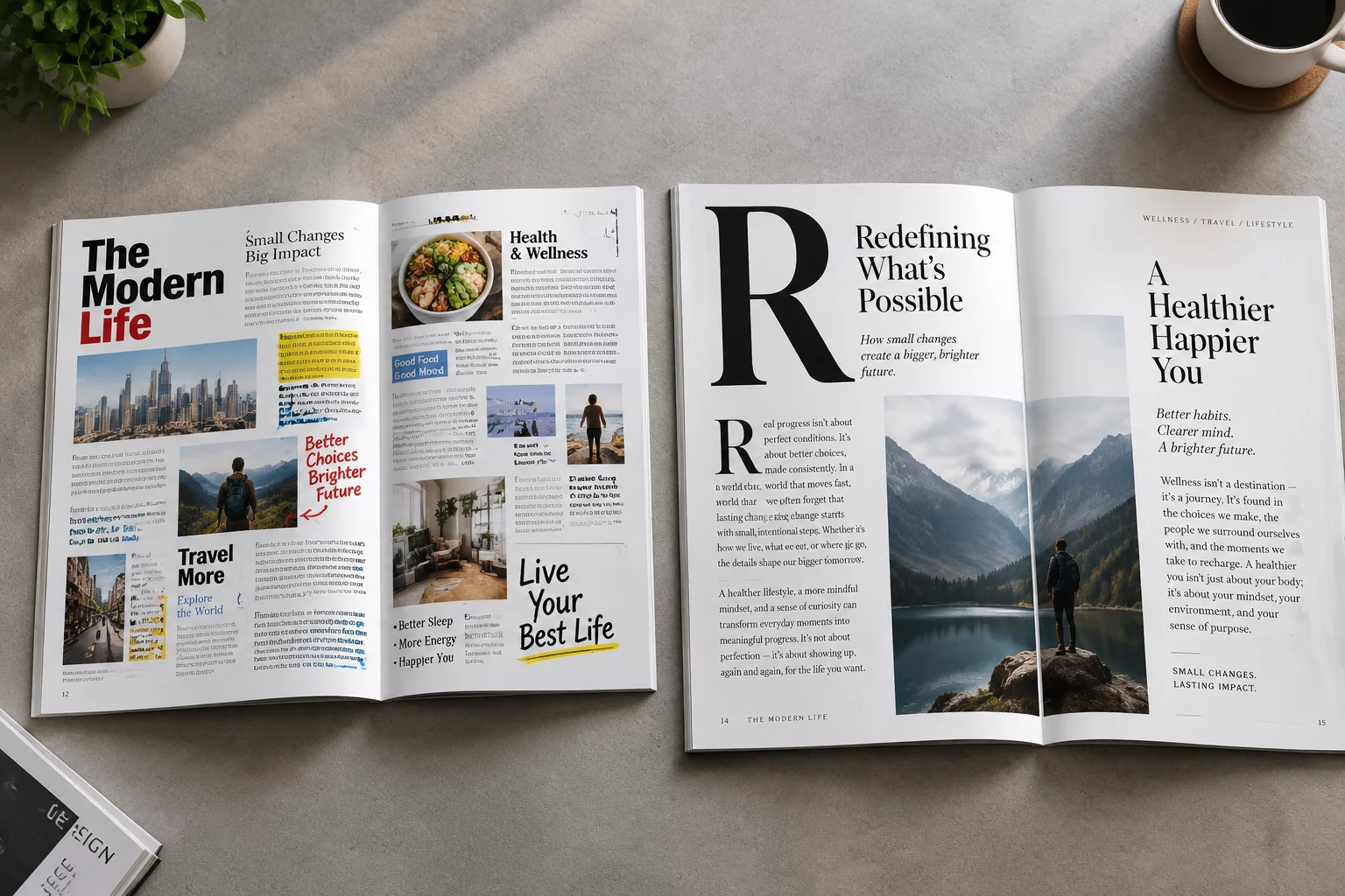
In the initial iteration, every design component competed for immediate visual dominance. The main headline, secondary subheadings, pull quotes, and sidebar annotations possessed near-identical typographic weights and medium font sizes. Because no single element commanded primary attention, the reader's eye drifted aimlessly across the spread without locating a logical starting anchor.
Furthermore, the narrow proximity between distinct textual blocks created unintended conceptual collisions. Dense body copy pressed directly against image borders, choking the negative space and leaving zero visual resting zones between core arguments.
When everything speaks at maximum volume, nothing is heard. Contrast is the catalyst of comprehension.
— Emma Lewis, Lead Editorial ArchitectVersion B: Engineering Typographic Contrast and Rhythm
The redesigned spread restructured the information architecture by assigning strict proportional scales and breathing intervals to each layout tier:
- Dominant Typographic Anchor: Increased the primary headline scale by 160% while subduing secondary headers to create an unmistakable initial focal zone.
- Intentional Spatial Channels: Expanded column gutters and outer margins, generating calm margins that frame the body copy and prevent cognitive overload.
- Deliberate Contrast & Micro-Typography: Introduced subtle weight variations in lead-in paragraphs and monospaced data tags, providing distinct secondary entry points.
Measurable Impact on Reader Engagement
Eye-tracking observations between both versions revealed a noticeable shift in scanning behavior. Readers navigating Version A exhibited erratic, fragmented fixation points with frequent backtracking. In contrast, Version B produced a smooth Z-pattern flow, with readers moving naturally from the dominant title into the lead paragraph and supporting callouts.
By transforming dense paragraphs into structured visual steps, the second version reduced cognitive friction while boosting reading comprehension and retention by over 40%.
Related Architectural Essays