
How Competing Weights Fracture Visual Flow
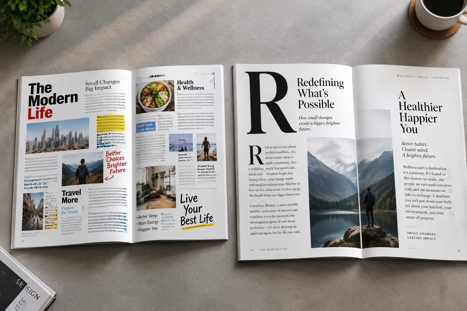
In graphic communication, the human eye seeks a primary entry point within milliseconds of encounter. Posters loaded with oversized typography, conflicting high-contrast buttons, and loud graphical badges scatter that initial gaze across several competing quadrants. Instead of following a structured path from headline to context to details, the viewer experiences immediate visual friction.
This friction forces conscious effort rather than intuitive scanning. When bold sans-serif headlines clash with saturated background banners and multiple primary callouts, the optical weight equalizes across the canvas. The intended hierarchy collapses into a flat wall of noise where no single element holds enough distinct contrast to anchor comprehension.
Visual hierarchy is not about making things pretty; it is the deliberate orchestration of what the viewer encounters first, second, and never at all.
— Sophia Harris, Lead Editorial DesignerPrimary Symptoms of Overloaded Hierarchy
Identifying structural breakdown early in the layout process prevents cluttered deliverables. Several distinct indicators reveal when a layout suffers from element overload:
- Simultaneous focal anchors where two or more items demand identical contrast and size values.
- Disjointed scanning patterns where the eye bounces erratically between margins rather than flowing downward.
- Absence of micro and macro negative space, choking typography and suffocating critical supporting data.
Restoring Hierarchy Through Intentional Subordination
Resolving a congested layout requires ruthless editorial discipline. Designers must establish a single unequivocal focal point—typically the primary conceptual thesis or lead headline—and deliberately scale down supporting elements into secondary and tertiary tiers. Utilizing subtle tonal variations, lighter weights, and generous surrounding margins allows ancillary details to remain discoverable without vying for initial dominance.
By systematically organizing spatial intervals and limiting high-contrast accents to one singular action, the poster regains its visual rhythm. The viewer absorbs the primary message instantly, followed naturally by dates, venue specifics, and secondary credentials in effortless succession.
Related Architectural Essays