
The Linear Sequence versus Focal Magnetism
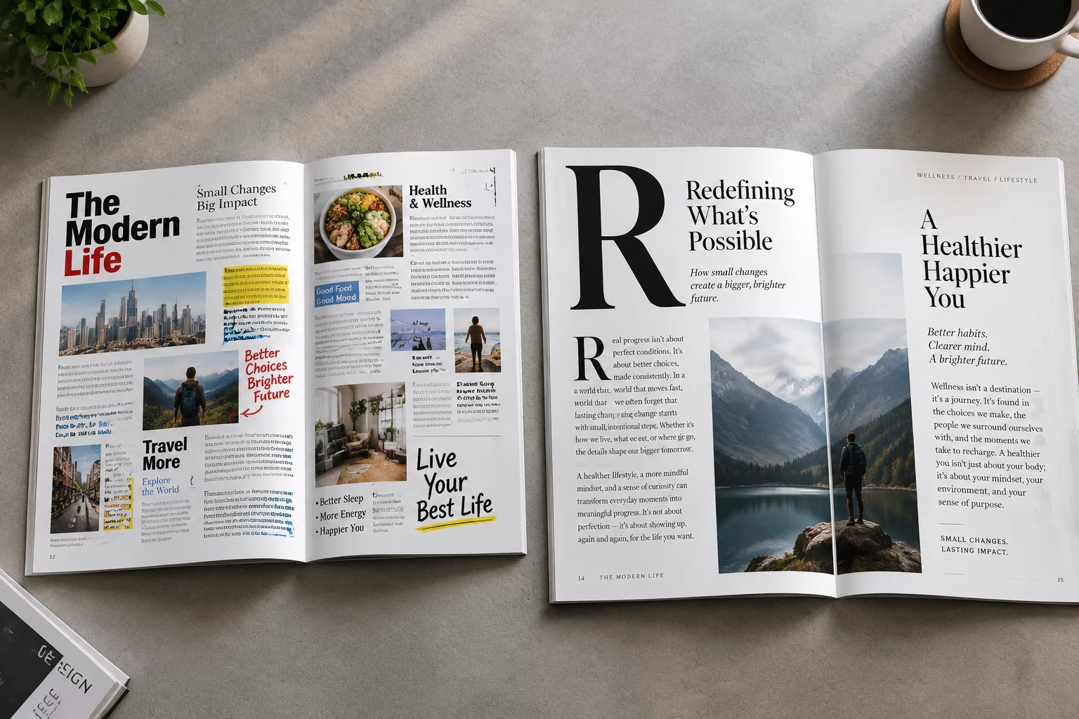
Readers rarely consume modern layouts in a strictly uniform, top-to-bottom sequence unless forced by monotonous prose formatting. In graphic layouts, the eye gravitates instinctively toward zones of highest optical density and tonal contrast. By shifting where bold weights and larger point sizes live, designers dictate whether the reader consumes the conclusion, the supporting data, or the contextual premise first.
In practical editorial testing, presenting the exact same three sentences under three typographic variations produces three separate comprehension outcomes. A prominent lead paragraph induces linear absorption, an isolated metric pulls an analytical scan, while a weighted conclusion fosters immediate action before the supporting details are even perceived.
Typography is not merely legible transcription; it is an active choreography of the reader's gaze across space and time.
— Daniel White, Editorial TypographerThree Architectural Patterns for the Same Content
Layout engineers utilize three distinct structural models to orchestrate eye flow across fixed copy blocks:
- The Top-Down Gutenberg Diagram: Employs a dominant headline at top left, leading naturally down to terminal reading gravity at the bottom right.
- The Center-Anchor Radiating Model: Positions high-contrast focal elements in the geometric center, drawing attention inward before dispersing the gaze outward to periphery details.
- The Asymmetrical Weight Distribution: Leverages heavy negative space opposite a dense typographic block to pull the eye across tension lines before settling on auxiliary annotations.
Measuring Scan Retention and Optical Friction
Eye-tracking diagnostics reveal that poorly placed high-contrast elements introduce optical friction, causing the reader's focus to bounce erratically between competing anchors. To achieve effortless comprehension, secondary elements must defer visually to primary beacons through deliberate value and scale steps.
Maintaining a consistent typographic ratio ensures that reading paths remain intuitive across desktop viewports and mobile screens alike. Spatial margins, line-height proportions, and systematic color values work harmoniously to preserve the intended narrative flow regardless of screen orientation.
Related Architectural Essays