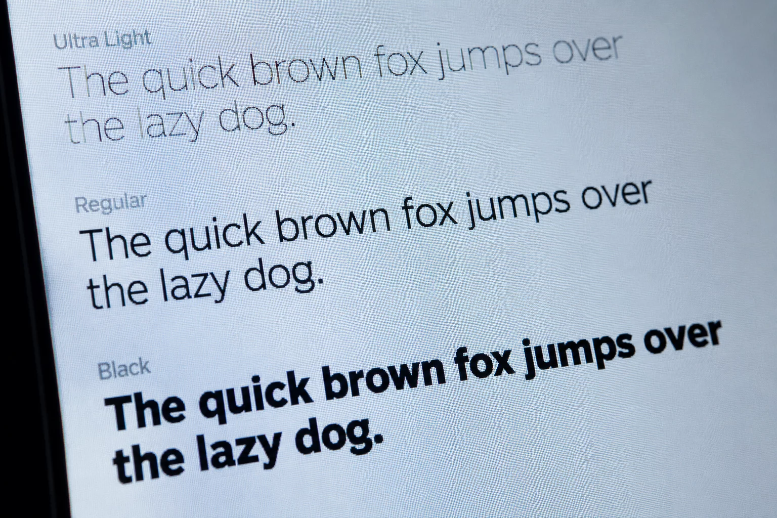

The Historical Legibility Split Between Print and Pixels
In traditional print typography, serifs guide the horizontal movement of the eye across extended prose, establishing subtle baseline continuities that accelerate reading flow. Early computer screens disrupted this physiological mechanic because low-resolution grids forced letter terminals into distorted pixel clusters.
Designers naturally gravitated toward grotesque and neo-grotesque sans-serif typefaces whose uniform stroke widths resisted screen degradation. Today, with mobile displays exceeding 400 pixels per inch, rasterizers render fine brackets and delicate horizontal terminals with exact precision.
Legibility on screens is no longer dictated by whether a letterform has serifs, but by how rhythmically its internal spaces breathe.
— Emily Davis, Editorial Type DesignerKey Optical Factors in High-Density Screen Typography
Evaluating typefaces for long-form screen reading requires looking beyond broad stylistic classifications and examining specific structural attributes:
- Generous x-height ratios allow lowercase letters to preserve distinct silhouettes at compact mobile point sizes.
- Open apertures prevent tight letterforms like 'e', 'c', and 's' from visually filling in under varying ambient lighting conditions.
- Moderate horizontal stroke contrast maintains solid pixel weight across both dark and light display modes without creating retinal glare.
Selecting Between Serif and Sans Serif for Editorial Layouts
When designing content-heavy editorial interfaces, modern transitional serifs deliver warmth, academic authority, and structured pacing for long essays. In contrast, geometric and humanist sans serifs excel in interface navigation, microcopy, and compact instructional passages where rapid scanning is essential.
The most effective digital publications leverage both classifications harmoniously, assigning sans-serif typefaces to functional user interface chrome and pairing them with robust, high-x-height serifs for uninterrupted body text immersion.
Related Architectural Essays