Why Similar Fonts Clash Instead of Complementing
When two typefaces share nearly identical stroke weights and proportions yet differ only in minor terminal details, the human eye perceives the pairing as an error rather than an aesthetic choice. This visual ambiguity forces the reader's brain to pause and decipher whether the variation is intentional. Combining two neutral geometric sans serifs often produces uncomfortable tension rather than elegance.
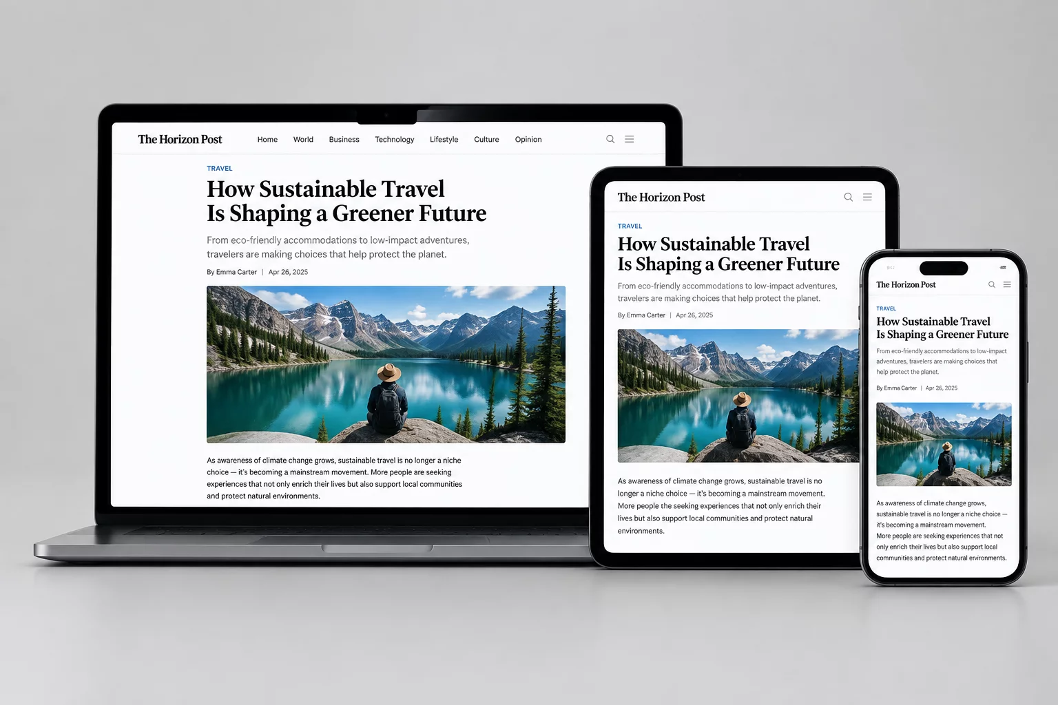
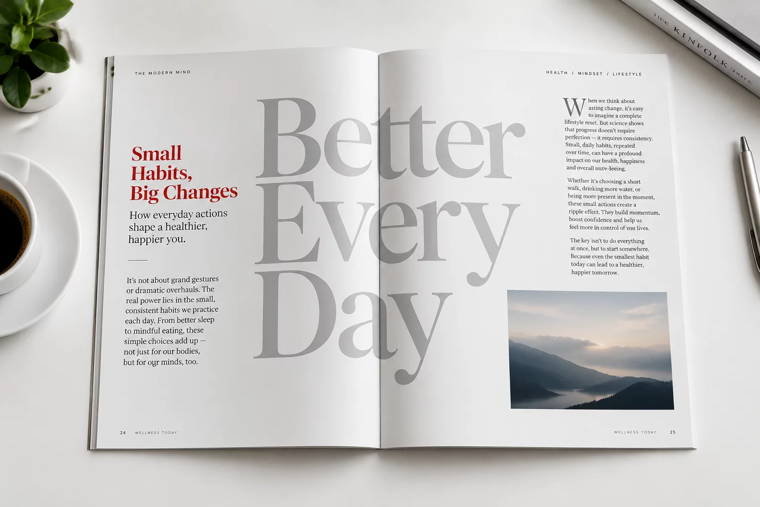
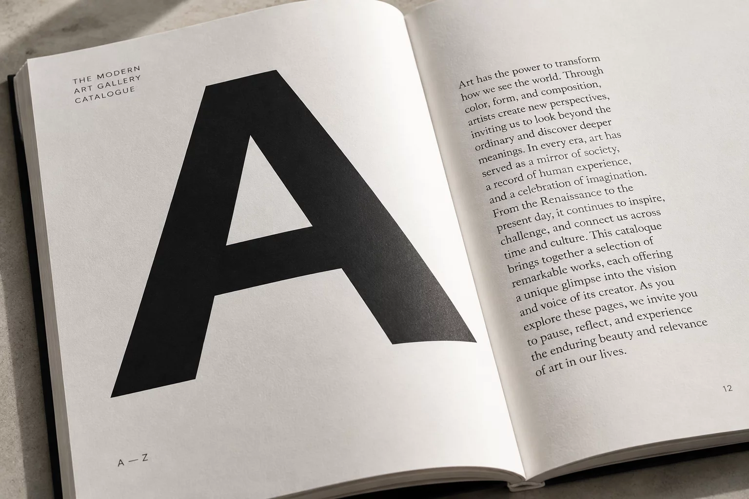
Editorial clarity requires decisive contrast across multiple typographic dimensions. Pairing an architectural serif header with a neutral, utilitarian grotesque body copy creates distinct structural roles. The header immediately commands attention through expressive serifs, while the body text retreats into silent readability.
Typographic harmony rarely comes from timid compromises; it emerges from bold, well-defined contrast governed by strict proportional discipline.
— Olivia Thomas, Senior Editorial TypographerFour Rules for Harmonious Multi-Family Pairings
Before introducing a secondary font family into your layout system, establish clear boundaries for where and why each style appears. Applying these core practices prevents typographic dissonance:
- Match or harmonize x-heights across families to maintain baseline consistency and avoid awkward jumpy reading rhythm.
- Limit the entire system to no more than two distinct font families, extracting hierarchy from weight and scale variations.
- Assign unambiguous functional roles so each typeface serves a dedicated structural purpose, such as metadata, captions, or display titles.
Establishing Hierarchy Through Weight and Scale
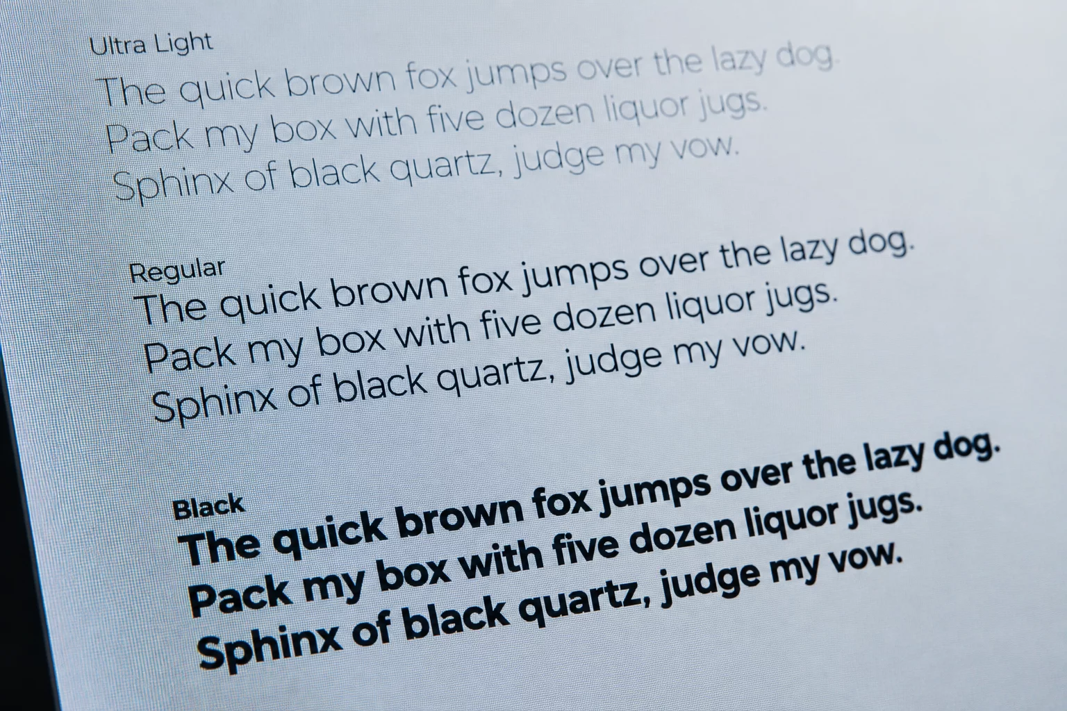
Relying on font switching alone to indicate structure leads to chaotic compositions. True visual hierarchy emerges when scale, weight, and tracking work alongside family distinction. A single variable font family can often supply all necessary hierarchy through contrasting weights, rendering a second typeface optional.
When a secondary family is essential, emphasize contrast in stroke contrast and optical size. Restraint remains the defining attribute of refined typography. Giving each typeface ample breathing space and consistent spacing ensures your layout communicates effortlessly.
Related Architectural Essays