
Fluid Scaling Versus Discrete Breakpoint Steps
Traditional responsive design relied on isolated media query thresholds where font size jumped abruptly between arbitrary values. While functional, this method left layouts awkward at in-between resolutions where headings either crowded container boundaries or appeared disproportionately small relative to available whitespace.
Modern layout architectures resolve this limitation through continuous fluid scaling. By establishing mathematical minimums, dynamic rates of change, and hard upper bounds, text adapts proportionally to viewport expansion without demanding dozens of manual CSS media query declarations.
Fluid typography is not merely about changing point sizes; it is about preserving the proportional relationship between text measure, white space, and visual gravity across infinite viewports.
— William Anderson, Layout StrategistEssential Rules for Proportional Type Systems
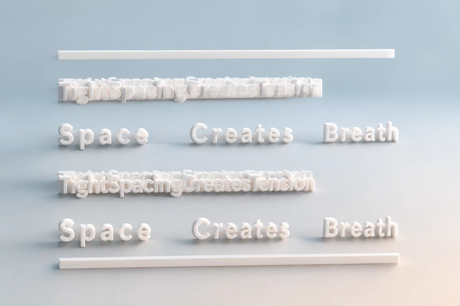
Structuring an adaptive type hierarchy requires balancing multiple interdependent variables simultaneously. Neglecting line height or line measure while scaling font size causes legibility to degrade rapidly:
- Maintain an optimal line measure between 45 and 75 characters per line by setting max-width constraints on body paragraphs.
- Implement inversely proportional line-height scaling so larger headline sizes tighten their leading while body copy maintains open, readable spacing.
- Anchor modular scales with rem units to protect user accessibility settings and browser root preferences.
Practical Implementation with Modern CSS Math
Implementing fluid typography in production code relies on the CSS clamp() function. By combining an absolute minimum rem value, a viewport-relative variable, and an upper rem cap, designers craft text that flexes smoothly while remaining predictable at extreme screen sizes.
When combined with container queries, responsive typography transitions from whole-page viewport dependencies to localized component contexts. This shift allows modular UI cards and editorial sidebars to recalculate their internal typographic hierarchies independently of screen width, ensuring visual balance across complex responsive layouts.
Related Architectural Essays