The Flaw of Metric vs Optical Kerning Defaults
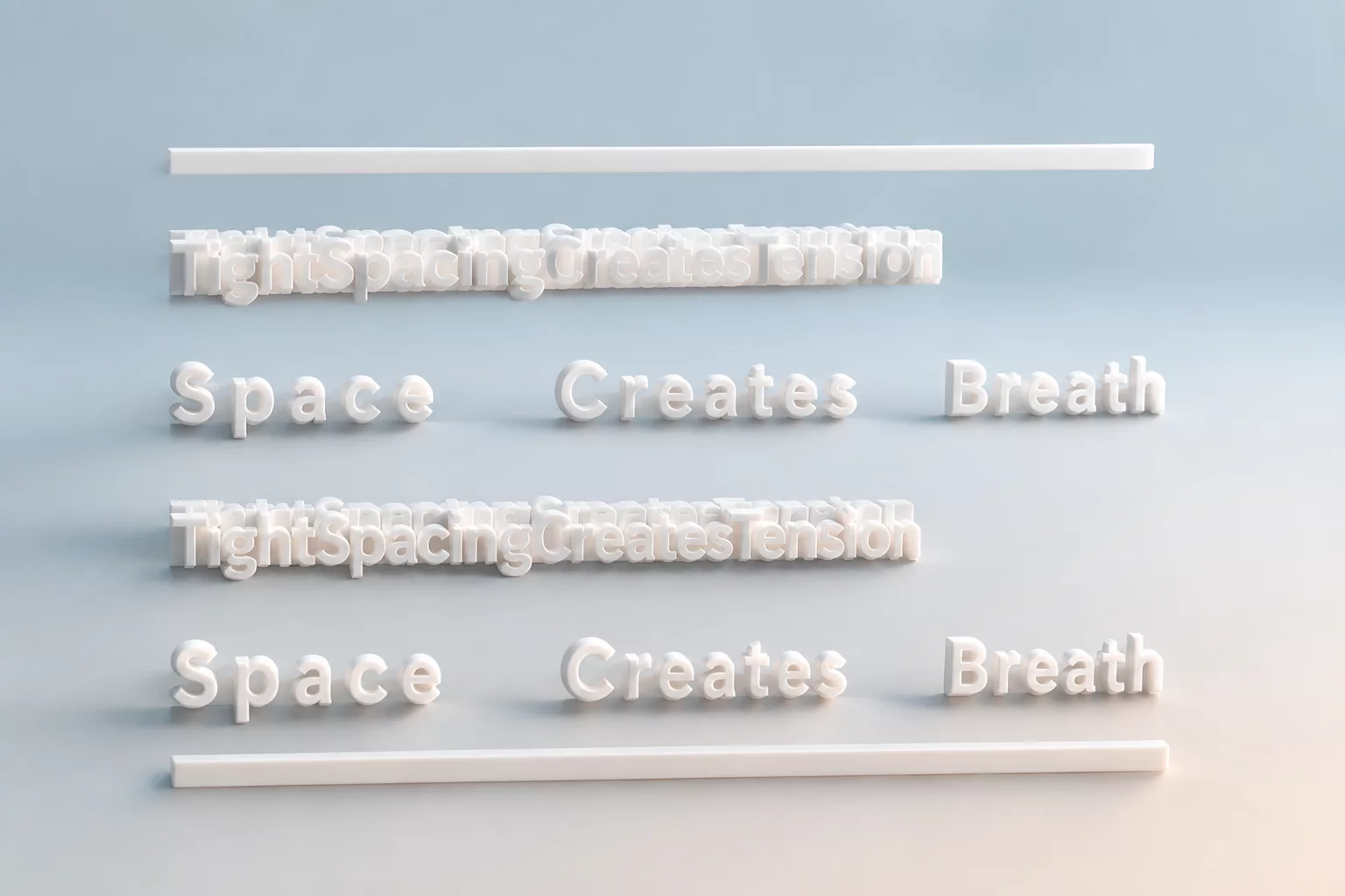
Digital typefaces contain built-in kerning tables crafted by type designers, yet generic font engines frequently miscalculate spacing around diagonal glyphs like T, V, W, and Y. When applied at large scale across posters or hero headlines, these mathematical defaults produce cavernous voids next to open bowls while crunching straight-stemmed letters together. The resulting uneven spatial rhythm forces the human eye to stutter rather than glide across the wordmark.
The primary problem stems from relying on mechanical bounding boxes instead of perceived negative volume. Diagonal letters naturally cast large pockets of empty air around their stems. Without manual optical adjustment, combinations like "AV", "To", or "WA" look as if an entire spacebar stroke separated the letters, destroying the cohesive silhouette of the wordform.
Bad kerning turns a headline into an accidental puzzle. Spacing should be invisible so the words speak without mechanical distraction.
— Laura Johnson, Editorial Type SpecialistThree Critical Spacing Blunders to Eliminate
Addressing kerning errors requires training the visual intuition to judge volume over measurement. The most catastrophic layout breakdowns usually trace back to three specific oversights:
- Ignoring diagonal-to-straight character pairs: Failing to tuck round or diagonal stems under capital overhangs like 'Ta' or 'Ye' leaves gaping visual holes.
- Over-tightening lowercase ascenders: Squeezing display titles without checking vertical ascenders produces clumsy collisions between 'fi', 'fl', or 'rt' letter pairs.
- Treating punctuation as passive spacing: Commas, quotation marks, and periods placed next to uppercase letters create disproportionate voids if unkerned.
Practical Methods for Optical Balance
Professional typographers often invert text or flip words upside down to assess kerning without reading the semantic words. This technique isolates the negative space between glyphs into abstract shapes, making volume disparities immediately noticeable. When working on large titles, group three letters at a time to systematically balance the relative volume between each adjacent pair.
Maintaining consistent typographic rhythm preserves the overall visual structure of your editorial layouts. By dedicating time to manual optical adjustments on display type, designers ensure headlines remain authoritative, legible, and visually balanced across print and digital media.
Related Architectural Essays