Cognitive Fluency and Perceived Effort
When typography feels effortless to read, readers intuitively attribute that ease to the message itself. Studies in cognitive psychology demonstrate that high-legibility typefaces increase truth-assessment scores, as the human brain equates processing fluency with familiarity and reliability. Conversely, deliberate friction through decorative or condensed letterforms demands higher cognitive load, signaling exclusivity, craftsmanship, or critical warning depending on contextual cues.
This psychological mechanism explains why modern digital products favor clean geometric and humanist sans-serifs for primary workflows. By reducing visual resistance across interactive components, interfaces foster confidence and swift task completion. However, stripping all typographic personality can lead to visual numbness, where crucial distinctions blur into homogenous blandness.
Typography communicates before it is read. It sets the temperature of the room before the first sentence is spoken.
— Jessica Taylor, Editorial Director at TypeMarginSubconscious Associations of Type Classifications
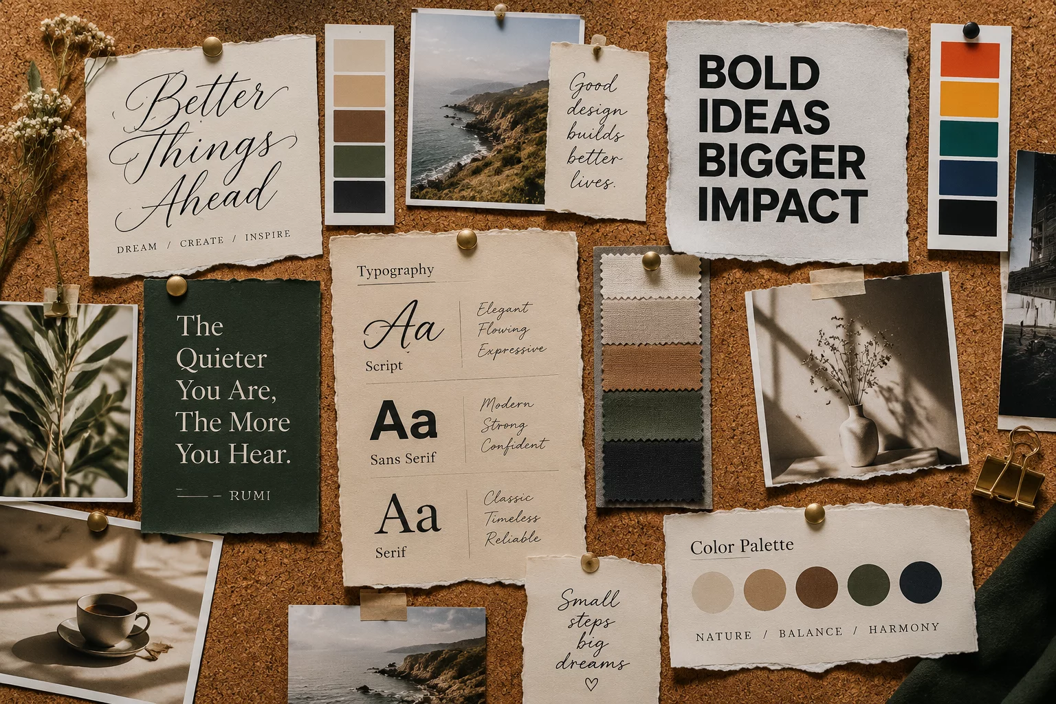
Every major typographic category carries centuries of historical context and psychological weight that directly influence how readers assess authority and warmth:
- Serif Typefaces (Transitional & Old Style): Evoke heritage, institutional credibility, and intellectual rigor by referencing classical editorial traditions.
- Humanist Sans-Serifs: Balance clarity with organic, calligraphic proportions to convey approachable empathy and genuine transparency.
- Geometric Sans-Serifs: Project modernist efficiency, architectural precision, and technological forwardness through strict circles and clean angles.
The Interplay of Weight, Proportion, and Space
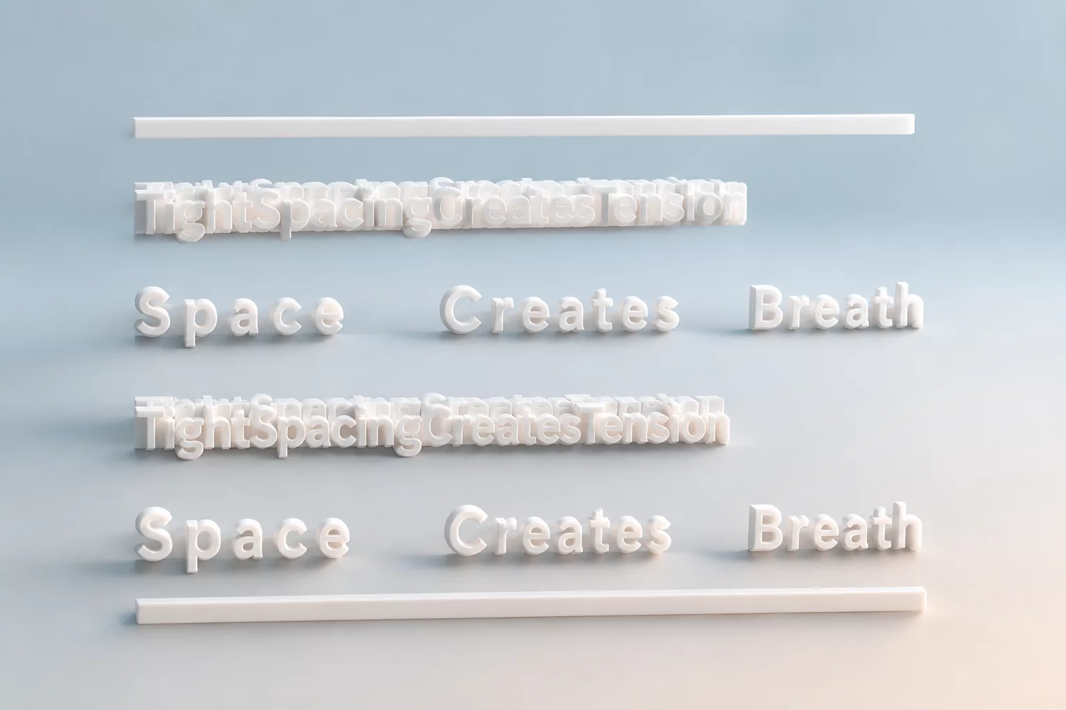
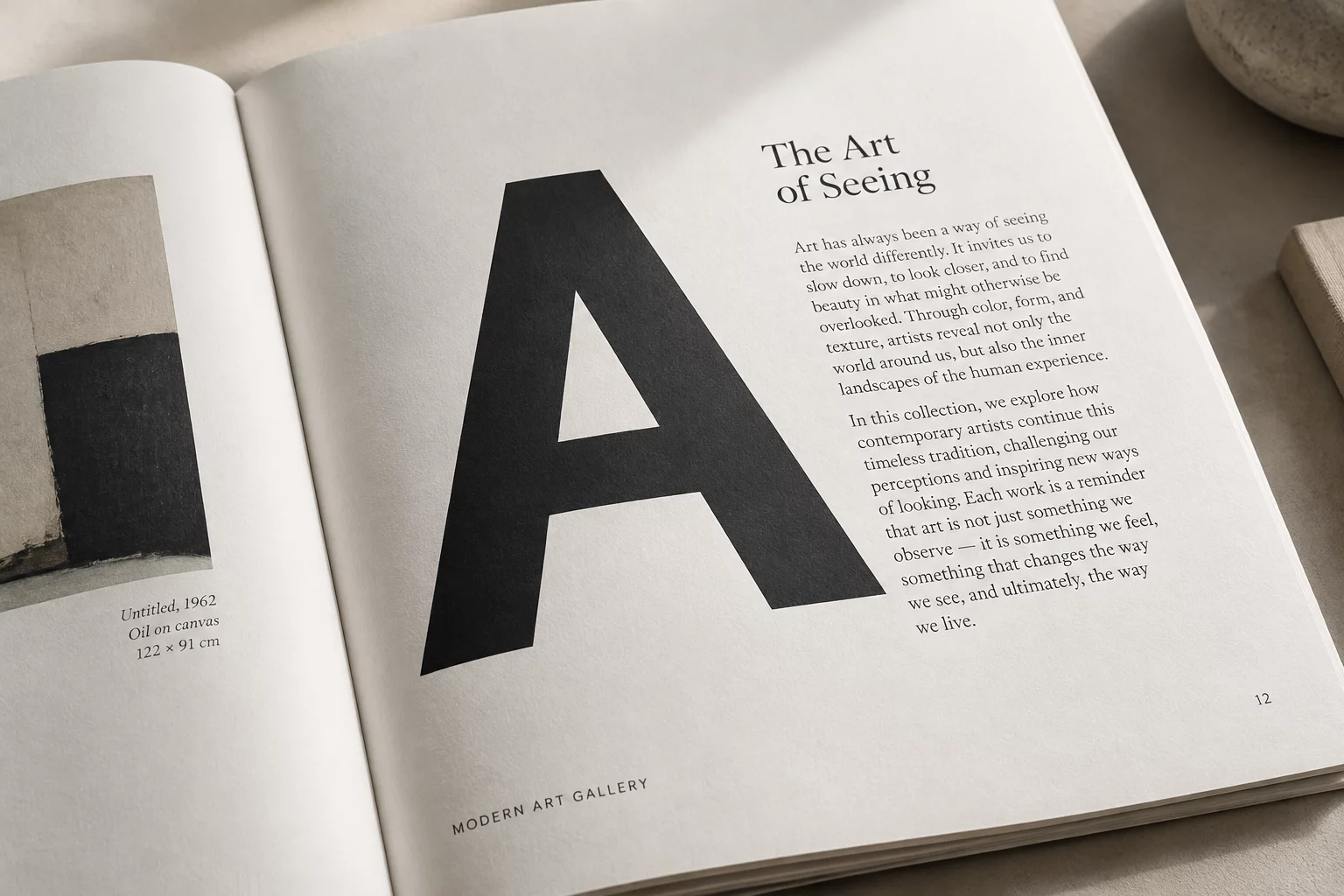
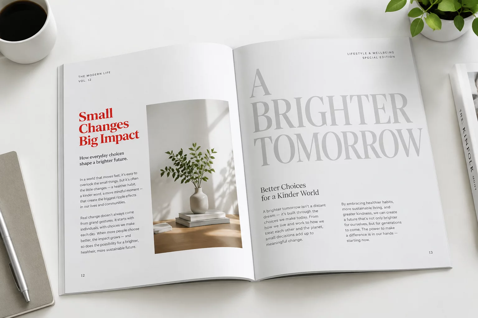
Psychological impact extends far beyond font classification into vertical proportions and x-heights. A generous x-height conveys openness and modern clarity, while tall ascenders and deep descenders imbue text with classical poise and literary rhythm. Heavy weights command urgency and dominance, whereas lighter weights communicate delicacy, luxury, and calm contemplation.
Mastering typographic psychology requires balancing these expressive qualities against functional reading mechanics. When typography aligns perfectly with content intent, the reading experience becomes an immersive dialogue where form and meaning reinforce each other harmoniously.
Related Architectural Essays